HTML and CSS Guide
  <button>Hello</button>
  <p>This is a paragraph of text</p>
Creates a button with the text "Hello" inside.
Creates a paragraph of text.
Syntax = rules for writing HTML code (like grammar in English)
  <button>Hello</button>


    <p>paragraph of text</p>

    <p>paragraph    of    text</p>

    <p>
          paragraph of text
    </p>
- Elements should have an opening tag and a matching closing tag.
- In HTML, extra spaces and newlines are combined into 1 space.
All 3 examples will show the same result on the web page.
Attributes modify how an HTML element behaves.
   <a href="https://youtube.com">
     Link to youtube
   </a>

   <a href="https://youtube.com" target="_blank">
     Link to youtube
   </a>
<a> = link to another website
href = modifies which website is opened when
clicking this link.
target="_blank"causes the link to be opened in a new tab.
One way of writing CSS code is using the
<style> HTML element.
  <style>
      button {
        background-color: red;
        color: white;
      }
  </style>
Modifies all <button>s on the page.
Change background color to red.
Change text color to white.
CSS Selector = which elements will be modified.
    button {
      background-color: red;
    }
all the styles for this selector must be placed inside{...}
Property background-color: (what we're modifying)
Value red; (what we're modifying the property to)
Here are some common CSS properties we can use:
    button {
      background-color: red;


      color:  white;


      height:  36px;


      width:  105px;


      border:  none;
      border-radius:  2px;
      cursor:  pointer;


      border-color:  red;
      border-style:  solid;


      border-width:  1px;
    }
Sets the background color: Common values:
- Color name: red, white, black
- rgb value: rgb(0, 150, 255);
- Hex value: #0096FF
Sets the text color: Takes the same values as
background-color (color name, rgb, hex).
Set the height. Common values:
- Pixel value: 36px
- Percentage: 50%
Sets the width: Takes the same values as height.
Removes the border:
border-radius: Creates rounded corners
Changes the mouse or cursor: when hovering over the
element.
Sets the border-color:
Sets the border-style: Common values:
- solid
- dotted
- dashed
Sets the border-width:
Each CSS property has a set of values that are allowed (<background-color>
allows color values, <cursor> allows
solid,
dotted,
dashed, etc.)
Here are some categories of values that are useful to know:
Color Values
- A color name: red, white, black
-
RGB value: rgb(0, 150, 255);
RGB is a more precise way of measuring color. Every color can be created using a combination of red, green, and blue (RGB). In CSS, this is represented by rgb(...)
Each color has a min value = 0 and a max value = 255.
rgb(0, 0, 0); = black
rgb(255, 255, 255); = white
-
Hex value
Hex is another way to write RGB.
#0096ff
- Each character in Hex is base 16, which means it can have a value of 0, 1, 2, ... 8, 9, A, B, C, D, E, F (16 possible values).
-
Using the first 2 characters, we can have 16 * 16 = 256
possible values from 0 - 255:
00 = 0
01 = 1
0F = 15
10 = 16
11 = (1 * 16) + 1 = 17
FF = (15 * 16) + 15 = 255
- This is the same range as RGB (0 to 255), so the first 2 characters in Hex are used to represent red, the second 2 characters represent green, and the third 2 characters represent blue. Usually, it's easier to use a Hex to RGB calculator to convert.
-
RGBA value:
rgba(0, 150, 255, 0.5);
Same as RGB, except with an additional a-value (alpha value). The a-value determines how see-through the color is. 0 = complete see-through, 1 = solid color and not see-through, 0.5 = 50% see-through.
Measurement Values
-
Pixels: 50px,
100px
Pixels (px) are a common unit of measurement in the digital world.
For example: a 4K screen is 3840px by 2160px.
-
Percent: 50%,
100%
A relative measurement. For example,
width: 50% means 50% of the width of the page (or if the element is inside another element, 50% of the width of the container element). -
em / rem: 1em,
1rem
Relative measurements that are useful for accessibility. em = relative to the font-size of the element (2em means 2 times the font size). rem = relative to the font-size of the page, which is 16px by default (2rem means 2 times the font size of the page = 2 * 16px = 32px by default).
Class attribute = lets us target specific elements with CSS.
    <button class="subscribe-button">
        SUBSCRIBE
    </button>

    .subscribe-button {
        ....
    }
Add a class to an element. The class name (the text between the "...") can be anything you want, but no spaces.
Target all elements on the page with
class="subscribe-button"
    <button class="subscribe-button">
        SUBSCRIBE
    </button>
    <button class="subscribe-button">
        JOIN
    </button>
Multiple elements can have the same class
    <button class="youtube-button subscribe-button">
      SUBSCRIBE
    </button>

    button {
      ...
    }

    youtube-button {
      ...
    }

    subscriber-button {
      ...
    }
An element can have multiple classes, separated by space
    .subscribe-button:hover {
      ...
    }

    .subscribe-button:active {
      ...
    }
These styles only apply when hovering over an element with
class="subscribe-button"
These styles only apply when clicking on an element with
class="subscribe-button"
    .subscribe-button:hover {
      opacity: 0.5;
      opacity: 0;
      opacity: 1;

      transition: <transition> <duration>;

      transition: background-color 1s;
      transition: color 0.15s;
      transition: <property1> <duration1>,
          <property2> <duration2>,
          ...;
      transition: background-color 0.15s,
          color 0.15s;

      box-shadow: <h-position> <v-position> <blur> <color>;
      box-shadow: 3px 4px 5px black;

      box-shadow: 3px 4px 0 gba(0, 0, 0, 0.15);
    }
Sets how see-through an element is: 0.5 = 50% see-through.
Sets how see-through an element is: 0.5 = 50% see-through.
1 = not see-through (this is the default value).
Transition smoothly when changing styles (often used when hovering).
Transition background color over 1 second.
Transition text color over 0.15 seconds.
Transition multiple properties by separating them with a comma.
Transition both background color and text color over 0.15 seconds.
Creates a shadow that's 3px to the right of the element, 4px to the bottom, with 5px of blur, and color of black.
Creates a shadow that's 3px to the right, 4px to the bottom, with no blur, and a very faint black color.
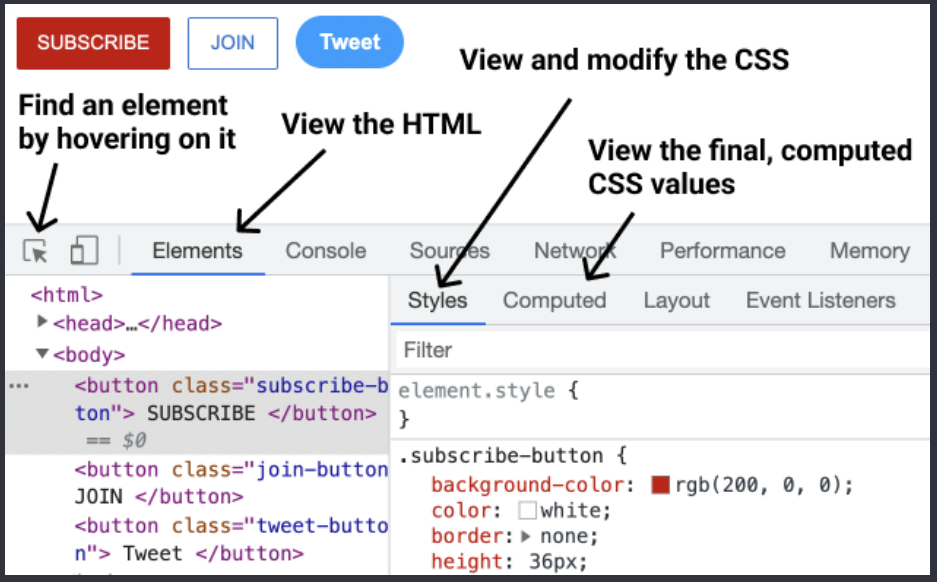
Lets us view (and modify) the HTML and CSS of a website directly in the browser. To open the DevTools: right-click > Inspect.
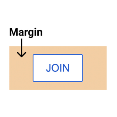
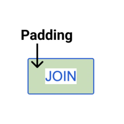
- Determines how much space an element takes up.
- Determines how far away elements are from each other.
1. Margin = space on the outside.
2. Padding = space on the inside.
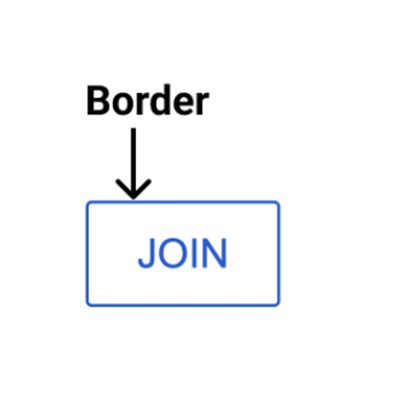
3. Border.
    .join.button {
      margin-right: 10px;
      margin-left: 10px;
      margin-top: 10px;
      margin-bottom: 10px;

      margin-right: -10px;

      margin: 10px;
      margin: 10px 20px;
      margin: <top> <left & right> <bottom>;
      margin: <top> <right> <bottom> <left>;

      padding-right: 10px;
      padding-left: 10px;
      padding-top: 10px;
      padding-bottom: 10px;

      padding-right: -10px;

      padding: 10px;
      padding: 10px 20px;
      padding: <top> <left & right> <bottom>;
      padding: <top> <right> <bottom> <left>;

      border-width: 1px;
      border-style: solid;
      border-color: red;

      border: <width> <style> <color>;
      border: 1px solid red;

    }
Add 10px of space on the outside of the element.
Normal margin pushes things away from an element.
Negative margin pulls things towards an element.
Shorthand for adding 10px of
margin on all sides.
Add 10px of
margin top & bottom and
20px left & right
Add 10px of space on the inside of the element.
Negative padding has no effect.
Shorthand for adding 10px of padding on all sides.
Add 10px of padding top & bottom and 20px left & right
Sets the border width.
Sets the border style (to a solid color).
Sets the border color.
Shorthand for the 3 properties above.
    .title {
      font-family: Arial;
      font-family: Roboto, Verdana, Arial;


      font-size: 30px;
      font-weight: bold;
      font-weight: 700;


      font-style: italic;
      text-align: center;
      line-height: 24px;
      text-decoration: underline;
      text-decoration: none;
Change the font.
A font-stack: if Roboto is not available, it will fall back to Verdana. If Verdana is not available it will fall back to Arial.
Change text size.
Change text thickness.
Another way to specify font-weight. We can use: 100, 200, 300, ..., 900. bold = 700, reqular = 400, semibold = 500
Other values we can use: left, right, justified
Adjust space between lines of text.
Underlines the text.
Removes underline.
<p> by default have margin-top and margin-bottom.
A common practice is to
1. Reset the deault margins.
    p {
      margin-top: 0;
      margin-bottom: 0;
    }
2. Then apply more precise margins.
    p {
      margin-bottom: 16px;
    }
-
Text elements (
<strong>, <u>, <span>, <a>) appear within a line of text.this is a
<strong>text element</strong>Useful if we want to style only a part of the text.
-
<span>is the most generic text element (it doesn't have any default styles.) -
We can style text elements using a class:
This is a
<span class="shop-link">text element.</span>
    .shop-link {
      text-decoration: underline;
    }
  <!DOCTYPE html>
  <html>
    <head>
      ...
    </head>
    <body>
      ...
  </html>
Tells the browser to use a modern version of HTML.
<head> contains everything that's not visible like the title and description (a.k.a. metadata) as well as links to fonts and CSS stylesheets.
<body> contains everything that's visible like buttons, texts, images, etc.Elements in the Head Section
    <head>
      <title>Title in the tab.</title>

      <link rel= "preconnect" href="https://fonts.googleapis.com">
      <link rel= "preconnect" href="https://fonts.gstatic.com" crossorigin>
      <link rel= "preconnect" href="https://fonts.googleapis.com/css2?family=Roboto:wght@400;500&display=sw
        ap">

      <link rel= "stylesheet" href="styles.css">
    </head>
Sets the title in the tabs.
Loads a font from Google onto the page. 1)Search "google fonts" in Google. 2) Pick the fonts and styles that you like. 3)Copy the code that Google provides into<head>
Filepaths
      href="styles.css"
      href="fold1/styles.css"

      href="fold1/fold2/styles.css"
looks for a file called "styles.css" beside the HTML file.
Looks for a folder called "fold1"beside the HTML file then goes into the folder and looks for "styles.css"
Go into "fold1", go into "fold2", look for "styles.css"
      <img src="image.png">
      <img src="pics/image.png">
      <img class="image" src="pics/image.png">

      .image {
        width: 300px;

        height: 300px;
        object-fit: cover;

        object-fit: contain;

        object-position: left;
        object-position: right;
        object-position: top;
        object-position: bottom;
      }
Loads an image image.png
Loads image.png in the pics folder.
Resizes the image to a width of 300px. Height will also resize to keep the image's dimensions.
If both width and height are set, the image may stretch.
Enlarges the image to cover the entire width * heigth area without stretching or distorting.
Shrinks the image so that it's contained in the width * height area.
      <inputs type="text">
      <inputs type="text" placeholder="Search">
      <inputs type="checkbox">
      <inputs class="search-bar" type="text">


      .search-bar {
        font-size: 30px;
      }

      .search-bar::placeholder {
        font-size: 30px;
      }
Creates a text box.
Add a placeholder (a label) to the text box.
Creates a checkbox.
Changes the font-size when typing into the text box.
Changes the font-size of the placeholder.
      .element {
        display: block;
        display: inline-block;
        vertical-align: middle;
        display: inline;
      }
Element will take up the entire line in its container.
Element will only take up as much space as needed.
Determines vertical alignment of inline-block elements.
Element will appear within a line of text (a text element).
- All the document in this page is taken from this file.